Tampilkan postingan dengan label Commentary. Tampilkan semua postingan

Sabtu, 28 November 2015

The Illustrative Designer Podcast


'Our iTunes Badge.'

The Illustrative Designer Podcast is now live. Our first episode is on iTunes and we have '3' more scheduled to hit ever couple of weeks. You can subscribe in iTunes by clicking here.

To support this new podcast I have developed a site so if for some reason you do not use iTunes or don't have access to that app all the time you can simply visit the site and listen to the podcast online. Visit the web site at: www.TheIlustrativeDesigner.com

It's taken me a while to work out all the technical bugs and I am still working on improving the optimization of the interviews since I record them over a phone line but if you listen to this with head phones it should be fine.

The first podcast features an interview with Bill Gardner the creator and founder of Logo Lounge. The end of each podcast will feature cool music sourced out by my friend and fellow designer John Nissen.

I hope you all enjoy and please leave some positive feedback at iTunes and be sure to visit the web site.

Von

Senin, 26 Oktober 2015

Promotional Poster


'Promotional Poster' Click art to view larger image.

I'll be teaching digital illustration again come Winter term on January 4th. This is a poster I created to hang up at the college to encourage students to sign-up. Once I start this years classes I'll be posting the assignments and all the resources I use at 'IllustrationClass.com'. Anyone can download the files and if you do let me know and I'll show your work to my class.

You'll notice several common themes I have repeated in this artwork. I've been illustrating a lot of tubes coming out of heads, snakes, wings, fire, another bird cameo and of course the token fedora. Not sure why I've been on this kick but it's fun so stop whining about it already.

I am a new CS2 Illustrator user as you'd know reading this blog. This project was only the fourth time I've used CS2 to create a project. It's getting moderately easier but still far slower then FreeHand unfortunately. One thing for sure it's getting harder to use both and eventually I'll have to completely cut all ties to the previous. I am still a little bitter with the corporate weasels at Adobe who forced this change on me. Eventually I'll have to illustrate a corporate weasel and of course use CS2 Frustrator...uh...I mean Illustrator.

Sabtu, 17 Oktober 2015

Top Ten Favorite Themes!


Fire Squad
A friend of mine asked me to create a logo for his sons engineering team that builds robots so they could get some t-shirts printed. Like most artists I jumped at the excuse to create some new robot art. This made me think about popular themes that artist enjoy creating around.

Creative Observation
I've mentioned it in passing in previous posts but have never really dedicated a specific post on the topic and that is 'The Top Ten Favorite Themes' of artists. It's not so much something I set out to discover but rather something I have observed over the past decade or so. Artist are most certainly a unique group of creative minded folk and I've noticed a handful of themes that tend to be common favorites they choose to do design and or illustration work on. Mind you this is by no means an iron clad list but just the most obvious ones I've noticed and have participated in creating myself through my own art. The latest offering above is no exception and motivated me to post this thread.

Top Ten Themes
The following are what I consider to be the top ten favorite themes of artists when creating their art. The order in which I have listed them is not according to popularity but rather just what came to mind when I posted this. I am sure I'll miss a few obvious ones but that is where you come in. Feel free to post others I may have missed or ones you think should be replace with another and I'll re-tool this list over time.

1. Robots: Evil, Benevolent or Humanoid it's all fun.
2. Monkeys: Ape, Chimp, Gorilla or go ape and do a 'Robot Monkey'.
3. Naked Women: No explanation needed.
4. Skulls: Or skeletons for that matter. It's all Bona-fide fun.
5. Monsters/Mutants: Home grown or universal the scarier the better.
6. Paranormal: Aliens, Angels, Demons, Ethereal forms etc.
7. Surrealism: Popularized by Dali, captured by most artists in doodles.
8. Dogs: Flea bitten art inspired by mans best friend.
9. Human Head: All matter of zany things have popped out of heads.
10: Machines: All kinds of mechanic contraptions and devices.

If an artist can combine several of the above into one composition then it's a dream project.

A couple other common elements used by artists are 'Flames' and 'Wings', but they tend to be integrated into the work of a given theme more then a theme in and of themselves. Someone had mentioned 'Pirates' which I agree is a most enjoyable theme to work with. But I think it' recent craze is due to the recent Disney movies. Of course every child at one time or another drew 'Dinosaurs' and all though another fun theme to work with it's not as popular as the ones in the list.

As you can see most of what drives us creatives tend to be very character driven.

I've had many artists email me on this list and I've adapted some content from their input. If you have suggestions let me know.

Kamis, 01 Oktober 2015

Go Forth & Create!


Click art to view larger image.

History
Pretty much every product or industry has some kind of ongoing rivalry. In soft drinks, it's "Coke vs. Pepsi." You have "Nike vs. Adidas" in the world of footwear, and "Mac vs. PC" in computers.

The communication arts world is no different. Graphic designers and illustrators have been arguing the merits of Macromedia FreeHand and Adobe Illustrator since the early days of digital design. I've been a diehard FreeHand user since 1991. Over the years, as more and more illustrators migrated to Adobe products, some have scorned me for sticking with FreeHand. But I didn't care. It facilitated my creative pursuits, and no one could argue with the results. I've won major awards and received recognition both nationally and internationally for work done with FreeHand. Sure, I've owned Illustrator since Version 8, but only for converting or opening files sent to me. I and a handful of other hardcore FreeHand aficionados have been holdouts, while most of our friends and peers have gone over to the other side.


No, I don't know what the pipe smokin' worm means. It just looked cool.

Bad News
In 2005, Adobe purchased Macromedia. With the merger, FreeHand's future looked grim. I knew it was time to make the change. Dragging my heels and Wacom pad, I knew I must begin the switchover. Little did I know that I was embarking on a tortured journey. Changing my primary drawing application wasn't easy. It was like learning to drive on the other side of the road or read a book upside down. Things that were intuitive, almost second nature, were now unfamiliar. I confess--I resisted the change. I was still fuming that the corporate officers and business analysts at Adobe would make a decision about my most important artistic tool. What if Leonardo was forced to switch to watercolor? You know he would have been grumbling a little, too.

My plan was to learn Illustrator gradually. With a booming year of business and a long list of client projects, I really didn't have room in my schedule, or motivation, to take a class or to switch abruptly. I bargained with Time: when FreeHand no longer worked on my Mac (due to the inevitable hardware and OS upgrades), I'd migrate. Really. But fate had other plans for me.


Bubbling ideas. Or as I like to call it, "Slow Boiling."

Closet FreeHand User
Recently, a Portland agency approached me to illustrate a promotional poster for the Adobe CS2 Creative Suite. Wow! I was totally jazzed and honored. When we met to discuss ideas, I quickly realized they assumed I was a CS2 Illustrator user. Now, I was no stranger to Adobe products. CS2 Photoshop had been part of my creative process for eons. And I actually owned CS2 Illustrator. But I had never created a whole project from beginning to end with any version of Illustrator.

They had no clue that a holdout was right under their very noses! I felt like an agent in a covert operation, a scout behind enemy lines. Should I blow my cover, and reveal my diehard alliance with FreeHand? All kinds of amusing arguments went back and forth in my mind. "Don't worry, Adobe owns FreeHand now, so it's not like you're technically a spy." How about this one: "No problem, we'll just do it in FreeHand, then copy and paste everything into CS2. After we save it as an Illustrator file, no one will even notice." I was starting to get a little nervous. I hoped my eyes weren't twitching and sending a Morse code message that a traitor was in their midst!


Yes, even spiders have duo-colored eyes.

Moment of Decision
The agency explained the project: Adobe wanted to use the poster to demonstrate Illustrator's various features, such as transparent vectors, smart objects, layer effects, VPF Technology, and the relationship of CS2 apps working together. It was a juicy project, to say the least. I would be designing a creative illustration for one of the planet's most famous software companies.

It just got better and better. Trying not to drool, I asked if there was a particular direction, theme or concept. The art director looked at me, and said the words that every illustrator dreams of hearing: "No. It's wide open. I like your art, so just do what you do." An account executive did mention to stay away from "edgy"--guns, nudity or violence were out. Okay, so no naked John Wayne Green Beret homage. Other than that, the door was open. Weird, strange, whatever. Whoopee!

Suddenly I came to my senses. There I sat, with one of the coolest projects ever, with total creative license. But I couldn't use my old friend and accomplice, FreeHand. The tool that was my partner for the previous decade was not invited to the ball. How ironic. Panic time!

I did weigh the idea of coming clean. Should I tell them I didn't use Illustrator as a primary drawing application? I decided against it...they didn't hire me because of my software. They loved my previous work, which was all done on FreeHand. My creativity doesn't come from a tool. However, for integrity's sake, I would have to create the artwork with Illustrator. I would have to get my butt in gear and go on a crash course to learn the software, inside and out.

I felt like a man emerging from a concrete bunker, after years of solitary resistance. I must learn CS2 Illustrator...and quickly. This would be a great test of the product's capabilities and ease of use. FreeHand wasn't an option, and it was time to be baptized by fire.


Happy little bee

Creative Process
Hmm, having a wide open creative brief wasn't as easy as it sounded. I had no idea where to start! For several days, I just let ideas slow boil. Then came a period of furious sketching. An idea started to take shape. I thought about what the AD had said, "Do what you do." That was it; that was the idea. So I did. I began "to do." I didn't hold back either. I stretched myself and created art that I thought would be inspiring for other artists. My idea was based on the premise "Why do artists use Adobe products?" The answer is, "To create."


No art is complete without a winged Roman worm

The End Results
I wasn't sure how Adobe would respond. Was the illustration a little too weird? Would the concept clash with their branding somehow? After all, this was a respectable software company, not MTV. But because creatives were the target audience, quirky is good. The agency loved it! They didn't have any changes, and presented it as created. Thankfully, Adobe was thrilled as well, and everything was green-lighted. I made some minor tweaks, then finalized the art.

I wish I could say the switch of software went as smoothly. Honestly, it was sometimes difficult and frustrating. Menus were different. Shortcuts weren't the same. And some tools just didn't exist in Illustrator. However, I found that Illustrator had some great capabilities I never dreamed existed. Later this year, I'm taking an intensive class for former FreeHand users. I'll miss my old buddy, but when you work in a creative environment, you have to be willing to upgrade and adapt, or technology will leave you behind.


Houston, We Have a Problem

Every Good Story Needs a Villain
Lest you think that this fairy tale had no cliffhanger, there was a bit of drama mixed with humor along the way. After many meetings, multitudes of eyeballs viewing the design (including both Adobe and agency staff)...after the artwork was finalized and just about ready to be handed off, along comes the "Ogre of the Audience Demographics and Financial Returns." Uh, I mean, the marketing person, who said, "Why is the worm guy wearing a Nazi helmet?"

(Cue sinister music)

We all know that marketing people have their place in business. And every creative professional knows there's often a tug-of-war between creative expression and the realities of the business model.

In this case, Mr. Worm was not wearing a Nazi helmet. Mr. Worm was sporting a vintage World War I German officer's helmet. The Nazi Party wasn't even around at that time. But no, this was going to be a problem. The marketing person was not going to budge, Nazi helmet or not. Someone might take this image the wrong way. They most certainly didn't want anyone to think they supported militaristic worms with suspect ideology.

I understood the concern, but, hello! What we had here is a winged worm wearing spectacles and a metal helmet. Perhaps we should take another look at the other worm, who wasn't wearing any clothes at all, only a fedora. He's actually smoking a pipe, too.

I can just see it now, protests at Adobe headquarters over the company's implicit endorsement of nationalistic, drug-smoking, nude invertebrates.

(You can probably tell that designers can be sensitive about their work.)

But hey, I'm a professional, and this isn't the first time someone has nixed an element in my artwork. We had to find another helmet for Mr. Worm. I finally settled on a Roman soldier's headgear. And unless you're from Carthage or fought in the Punic Wars, a Roman helmet shouldn't offend anyone. Here endeth my rant, and an amusing anecdote about worms smoking pipes and wearing helmets.

(By the way, I preferred the German helmet because of its sub-culture nod to one of my childhood favorites, Ed Big-Daddy Roth. He was a California illustrator and custom car builder who was influenced by hot rod and motorcycle culture. We illustrators like to include subtle references like that from time to time.)


Epitaph
Anyway this story has gone on long enough, so I'll end it here. I hope I provided some insight into the processes, challenges and zany episodes in an illustrator's average workweek. If you're interested in seeing more behind-the-scenes views of how the art was created, I'll be posting a project tutorial at IllustrationClass.com.

I think it's funny how things work out. For a while, I was dreading the idea of switching from FreeHand to Illustrator. I was that skinny kid at summer camp, shivering at the end of the diving board, scared to jump. Along comes this project, with a not-so-subtle push that got me in the water.

Life is an adventure. I'm really thankful to be able to work on such cool projects.

RIP, my old friend, FreeHand.

If you'd like to see this project from concept to completion you can view it via a free tutorial by clicking here.

Sabtu, 05 September 2015

It'll Make You Sick!


A while back I did the above art for a 'Barf Bag' art contest ran by 'www.DesignForChunks.com'. (No longer online) Virgin Atlantic Airlines sponsored the contest and out of over 500 international submissions mine was picked to be part of a limited edition set Virgin would actually produce and use on their international flights.

You can watch a CNN Video about the contest and see my bag in it here.

Well a few weeks back a friend of mine emailed me and informed me that 'The Oriental Trading Company' had ripped-off my barf bag artwork. He attached the following image.


I was surprised they'd actually derive their art so closely from my original. The fact the toy product was also called 'Barf Bag' furthered my suspicion in regards to their so-called inspiration for the design. I realize the derived art they created just flat out stinks, if you're going to rip-off another design at least make it look good. But then again I guess if they could make something look good they wouldn't need to rip-off another persons art?

This isn't the first time I've had my art ripped-off. Over the past several years it's happened about six times now. Most of those times I find out from other people who come across my work online and then let me know. Some have tried to create whole shops on Cafepress.com using my art on mugs, clocks and throw pillows, others have broken into pdf files and have sold my artwork on iStockPhoto.com. Another person posted my work on a russian web site and offered it as clip-art. I am amazed that people think they can get away with this? And yet they do for at least a little while until they are caught. The guy on iStockPhoto.com had '46' orders before he was shut down. Who knows what those '46' people will do with my art that was stolen?

Today I've been talking with the legal department of Oriental Trading Company to resolve this matter. I am seeking compensation for the usage. I am not going to be a jerk about it but they need to be fair and honest about their artist infringement. The general counsel for OTC said they had bought the product from an Asian vendor but as you can see in the image above they have '©OTC' in it. That makes them owners of illegal art and they are profiting from it.

I have learned my lesson, all my pdf files now are encrypted and I file quarterly copyright registration with the US Government to protect my unpublished artwork.

I hope they do the right thing and I'll update this post when I know more.

***UPDATE***

Well I've been going back and forth with the Oriental Trading Company and they've agreed to pay the usage fee I requested so that is cool.

I am glad I didn't need to get a lawyer involved.

Jumat, 17 Juli 2015

IllustrationClass.com Launched


Last summer I was asked to teach a digital illustration class at the local college visual arts program once a week here in Salem, Oregon. I had never taught before so this was a whole new experience for me. I quickly realized the way my students learned best was when I demonstrated a process. I literally showed them how to go about doing a creative task and commented on it. This led me into developing numerous step by steps I could show them each week.

Over the course of last year I built up a nice little archive of teaching resources. I also posted them on the 'HOW Design Forum' to let other creatives benefit from them and due to that being received so well I decided to give them a proper home on their own site.

You can download all my teaching step by step tutorials at:
www.IllustrationClass.com

I hope you enjoy them.

Von

Selasa, 14 Juli 2015

A Day in the Life of a Designer.

Recently on a design forum the topic of how a designer should deal with clients who like to play art director came up. I've given this topic much thought over the past decade and I'll be honest, I haven't always made the right decision. One of those unfortunate times was when I drew an unflattering caricature of a marketing director and put it on her desk. Even-though she wished to fire me she didn't have the power to do so. Not smart. Thankfully I handle such situations better now. LOL

In general I think the whole process is a balance.

Sure I've had clients who were knobs and I told them to take a hike in no certain terms and you know what they really got pissed at me. Saying stuff like "You're willing to turn down the money?" or "I can't believe you won't do this?" I try to explain to them my reasoning but it never sinks in with them. Paramount in their mindset is their own opinion and because of that I know the design will suffer so it's not worth the trouble.

Other clients who on the surface seem to be a pain I can see past their ignorance and realize some upfront pain is worth the potential that lay beneath.

Lets face it commercial art isn't fine art. Sure I think it's critical for a designer to have a passion and let that fuel his creative pursuits but those creative pursuits need to accomplish a commercial end. If the art changes and tweaks are not moving it towards that end objective and is just a non-designer playing art director then a designer needs to step up and give a well reasoned response as to why that shouldn't be done. If the party insists then you make it clear that project failure is on their head and decide if it's best to drop them or ask them to find another creative to assist them.

At speaking engagements I often tell a story about my time at Upper Deck where a weasel marketing director tried to play art director on a logo job. I submitted a tenth anniversary logo to him and what I got back in return sent me over the edge. I was about to call him up and tell him how much of a dork he was and then realized the best way to do this was to do exactly what he requested.

Long story short here is how it played out:

This is the logo I submitted originally. They whined that it didn't have the 'Upper Deck' logo in it even-though it says 'Upper Deck' and even-though it goes on product with the logo already on it. Redundant is marketings middle name.


At this point I am still playing nice. Fine here is your crappy logo.


I get back to my office and find this on my desk. What the? 400%? This guy is a uber knob. Why I ought to go Keith on them! @#$%! But wait I have an idea...


...Instead I did exactly what was requested. I executed (Pardon the pun) his well thought out art direction and left the print out on his desk and went to lunch.


He got really pissed at me and called me up and told me so. In a nut-shell I said "I did exactly what you asked for." He responded "That isn't what I meant." I said "I can't read your mind and maybe you shouldn't play art director." In the end he got the message and the logo came out decent.


Doesn't always work but you should always try to defend good design and if in the process you can make marketing weasels squirm all the better.

PS: I ran across this post on 'Speak Up' that had a great song on it called 'Make the Logo Bigger.' Too funny.

Jumat, 03 Juli 2015

Navajo Nation - Kaibeto, Arizona

Wow! That is all I can say after spending 11 days in Kaibeto, Arizona. It was my first time to help out with a vacation bible school our Church has done for the past five years on the Navajo Indian Reservation. Over the next few days I'll post several photos I took while there. The kids were great but there was also many local characters I enjoyed as well.

Francis
This Navajo gentleman visited every day and would hang out with us. Due to a car accident he is deft and is mute. Talking to him is like playing charades. He's a really friendly guy and apparently doesn't see any problem with the politically incorrect 'Indians' logo which some seem to think is insensitive. Francis loves the Indians logo and wears the cap all the time. I met another Navajo who is a diehard Chiefs fan and loves that logo too.


White Mesa
The Navajo nation is a beautiful place. Filled with mesa's all around and cool smaller scale grand canyon type of landmarks. This view was from one of our VBS locations.


Happy Dude
One of the Navajo kids attending VBS. I think his name was Rueben.


Piggy Back
One our High School students 'Jacob' carrying around a little Navajo girl during games.

Senin, 08 Juni 2015

Portrait - Jacob Renfold


Back in like 1995 me and my wife noticed our phone blinking meaning there was a message left. I went over to the phone and hit the button to listen and the following message played.

"Hello this is Jacob Renfold. I called to get my ears cleaned. I think there full of wax. I can call back again later. Thank you."

At first I thought it was my goofy friend Matt who loves to do stuff like this just to mess with my head. But then the more I listened to it I realized some elderly guy had dialed the wrong phone number. I saved the message and then played it for my wife a few minutes later. We both laughed.

We kept that message saved for about five years until we had to switch our phone service. We'd play it for friends who came by to visit. How odd that a complete stranger would be such a source of entertainment for us without him ever knowing about it. It made us both wonder over the years who Jacob Renfold is and if he ever got his ears cleaned?

Jumat, 05 Juni 2015

Craptacular!

Today I participated in the Portland AIGA chapters 'Student Portfolio Review'. The first 80 students to sign up get the opportunity to present their portfolios to 20 industry professionals. Each of us had 4 students books to review. My assessment of most? Well I think you get the idea.


Student Number 1 This first students work had good potential, signs of emerging talent for sure. His manner of communication was somewhat lacking but understandable. His enthusiasm for what he did and what he wanted to do and learn was nothing short of contagious.

His work was above the norm although a bit predictable at times in terms of style. But I can tell he has the raw skill needed to survive and eventually thrive, he just needs to refine his craft and process. Turns out he's also from Salem so I told him if he ever needs feedback I'd be more then willing to help him out.

Student Number 2 This student was borderline marginal at best. On par with a Kinko's quality design service. His work had a somewhat amateurish flair and made me nervous about his future success. I do feel he can improve but he's a long way from even being a junior designer, more on par with grunt production artist as it stands now.

The common denominator with all his work was the obvious tool-driven design solutions. His concepts were at best half-baked and the execution and attention to detail in his work was pretty weak.

Student Number 3 The third student was absolutely craptacular! I was at a lost as to how to give him any form of positive feedback what so ever. Usually I can find something but in this case it was trying to find the lips on a chicken, they just aren't there. Frankly he should not even be considering this industry as a career. I know that sounds harsh but unfortunately it's an honest and accurate assessment based on his work.

On the review form I filled out I basically told him as much. AIGA told us to be brutally honest with these students so I was. I tried to be as friendly as possible but it's hard to come off that way when everything about the persons work is nothing short of crap. He just doesn't have it.

His work is a testimony to knowing tools of our trade but having zero creative skills to utilize them effectively. He is what I'd consider a 'Hack'. 15 yrs ago he would have never pursued this career because the level of craft needed to even enter into it demanded you could do a certain level of creative work. Well the cheap PC has removed that industry speed bump and we have all sorts of educated tool savy designers flooding the industry who 15 yrs ago would be flipping burgers instead.

I must admit I felt a little guilty writing the review only because I didn't like knowing that my opinion was going to hurt him. I don't like knowing my words will cause him pain. It's this part of doing these reviews that I really don't like. I understand it's necessary but it's certainly not fun.

Student Number 4 At least the fourth student made up for the past two books I had to let assault my eyes. I must say first off that this girls presense is very professional but at the same time approachable and friendly. She is the best designer I've personally seen come out of a local school in four years. Great design but more importantly great concepts behind the design. She is a 'Good Thinker' and thus a good designer. She has a good grasp of how things work and to top it off she is just a good communicator. She is going to go far. Reviewing her work was a true joy, I did have some good feedback about a handful of pieces and how she could improve and strengthen her book but I didn't have to address any of the basics her fundamentals were iron clad and dialed in with precision.

Some firm is going to nab her and be a better place for it.

So How Does This Happen?
You have two students one whose work is on par with a polished turd and another whose work is anything but student in quality? Both have the same tools, both had the same opportunity, both have the same parameters to work by in this industry yet one is good and the other bad. I am not talking personal taste, what I like is what I like and what you like is what you like. This wasn't a vague dislike anymore then it was a vague appeal I had for the other designer. This was an absolute situation and the proof was the work.

Schools do a good job of teaching students how to use the tools. What are the proper techniques and methods used to create the design. But the one thing that seperates the good from the bad seems to be the one area art schools lack in and that is 'Concepts' the art of thinking creatively. How do you teach a student to be creative? How do you teach them to be good thinkers? Can you even? Will our PC society allow us to call a spade a spade anymore as far as talent and skill goes? Can a design teacher just tell a student at some point "Look you need to give it up and find a new career because you are simply not good enough." Allowing these people to further self-deceive themselves into thinking they are legit designers is not only dishonest to them but it hurts our industry as a whole.

I am sure some will take offense at these comments? I know I probably haven't adequately relayed my feelings very well in this regard but I think most designers will understand what I am trying to say? Life is too short for bad design. I always come back to the same thing when I think about design in the larger sense. Creation itself is the ultimate example of good design, you don't find bad design in the animal kingdom. You might find strange beasts but thier purpose puts their seemingly bizarre design into context.

I am not pretending to have any sure fire answers but maybe teachers need to head off these type of portfolios in mid-stream before they waste their time and money pursuing a career that their tool-driven designs cannot help them succeed in?

Senin, 01 Juni 2015

You're Hired!

Over the past three years since I've started my own design business I've had a lot of art students contact me asking for various forms of advice. I am happy to share with them and I hope it helps in their pursuit in this industry. A while back someone on the HOW Design Forum asked for insight in regards to an interview they were going to have the next day. This caused me to think back when I interviewed after art school seeing as everyone else in the forum was already giving good solid advice about what to do, I decided to share with this person some real-world examples of what not to do that I personally experienced while interviewing.

What not to do Number 1: If your sick re-schedule it. I didn't and during the interview I was sniffling and playing yo-yo with post nasal drip. Then at the end of the interview I sneezed put my hand up to cover my face and deposited about 12 fluid ounces of snot in my right hand. Immediately after doing that the art director finished looking at my book, smiled and extended his hand to shake mine while standing up. Remember, I now have a hand full of snot so what should I do? I can't tell him "Sorry but my hand is full of snot right now." So in those few moments panic started to set in and as I stood I let my right hand slide against the padded cushion of the chair wiping the snot off in one constant motion as I then raised my arm and shook his hand hoping I had wiped it clean. Needless to say I didn't get the job and someone using the chair later got a nice slimy surprise.

What not to do Number 2: Never mention other design work you didn't do that you've seen in public that you didn't like or thought was poorly executed. Murphy's law dictates that the art director interviewing you when you comment on fore mentioned work will be the one who did that work you didn't like and they won't appreciate your design opinions.

What not to do Number 3: Put your portfolio in a safe secure place the night before you goto an interview. This prevents any cats from pissing on it to mark their territory i.e. your portfolio case. And since they do it during the night the urine dries thus making you unaware of the problem until your in your really hot car half way to the interview location and something starts smelling really hinky.

What you might not want to do Number 4: When a company shows enough interest in hiring you that they have a two hour phone interview and then pay to fly you to meet with them for another interview onsite, it's a good idea to dress professionally and not wear a t-shirt, shorts and sandals to the interview. Then again I got the job with Upper Deck so maybe it's ok to do that? I still get ribbed for that to this day.

Minggu, 31 Mei 2015

Crappy Saturday.

A few months back my wife left for the weekend to attend a womens retreat so I played Mr. Mom with my two daughters. Saturday is normally the only day I ever sleep in so when my youngest woke me up at 7:30 am it was a bit difficult.

I promised them the night before I'd take them to the pancake house so we got dressed and headed off. During breakfast my daughters asked me to tell them a story about myself growing up, my oldest said "You know those funny stories where something happens to you. They make us laugh."

Well I thought to myself "It's been a while since something funny happened to me." Ok, that was a big mistake. I guess that was God's cue to add another one into my hopper because when we got home, opened the garage door and proceeded to walk inside we couldn't. Walk inside that is, the door was locked. We keep the key in a small utility drawer in the garage so I went to retrieve it and it wasn't there? Then I remembered my wife saying last week "I lost the key to the garage."

At this point I said "Uh oh. No key." and my daughter started whining how she was going to miss the birthday party she was invited too later that day and how the presents were inside the house. I decided to use my cell phone and call a friend and realized I didn't have it. And like one of those bad dreams where no one is around to help you, all our neighbors were gone for the weekend. Great. I then noticed my second story window open and considered climbing up but the pitch of our roof is such that I knew it would quickly go from humorous to dangerous so I axed that out. I then asked my daughter if she wanted to try and she said "No way!"

My youngest daughter said "We could goto our friends down the street and call." I shook my head and said "Ok lets go." Well it's about this time that a particular aspect to this story kicks in which could not have come at a worse time. My bowels chime in and say "I need to take a crap. Now!"

I walked about four steps and said "I can't go, I think I have diarrhea?" and then proceeded to grimace and dance around like I was standing on a hot plate. I told my daughter "Hurry go tell your friend to call a locksmith." She took off on her scooter. My other daughter is now pointing at me and laughing "You dance funny." "I am not dancing!" I said a little too sharply.

About 2 minutes go by and my bowels speak up again "Sorry but we aren't waiting. Open flood gate 3!" Panic sets in instantly and I look towards a shelf in our garage that contains cleaning supplies and toilet paper and hop over rip open the pack and grab a roll. I then take off as fast as I can run without allowing my butt cheeks to seperate and yell back at my daughter "Stay in the garage I am going to the backyard. Do not follow me!"

I make it 3/4 of the way and then experience what I can only assume is the same feeling a Depends user has and realize I didn't make it. So now I am hunched over behind our porch in the backyard in shock thinking "I hope my wife is having fun at the coast." I am hunched because if I stand up all the way neighbors can see me. So I proceed to take care of business. (Who said camping doesn't come in handy)

I come back around to the front of the house successfully purged, undies and all buried in a shallow unmarked grave in our back yard flower bed and hoping my daughter was a success in calling for help. She was and about ten minutes later the locksmith showed up opened our door in about 20 seconds and I paid him $45.


So now my daughters have a fun story about their goofy dad they can laugh about from now and for the rest of their lives. Sometimes I wonder why crap like this happens? Pardon the pun.

UPDATE TO STORY
Since posted this side order of my life, we have moved to a new house. So the obvious question is "Did you dig up the shorts?" Well, no I left them buried in the backyard for the new home owner to discover some day when he's doing yard work. I figure by that time it'll just resemble a very large dirty rubber band. The undies part will be long gone by then. Why are you making a funny looking face?

Selasa, 14 April 2015

Jesus Wins!

A few years back I was waiting in line at the grocery store. All along the aisle was chocolate bunnies. I wondered what Jesus would think about the Easter Bunny. At the time I was illustrating a set of 'Business Icons' that used almost a Fisher Price™ figure style in them. I adapted that format and created this image.

Of course I emailed it to my Mom and her only comment was "I don't think that's funny at all." Which of course made it hilarious.

So with that said I hope your Easter is a good one!

Senin, 13 April 2015

The bird that didn't soar.

Sometimes when working on projects it becomes apparent mid-stream that the likelihood of the end result being what you expected or was told to expect just isn't going to happen. This project was just such a case.

I was contacted by Upper Deck Company Entertainment to illustrate a mark they could use on a card game for 'World of Warcraft' the mark they wanted was a two headed eagle. In all I did 3-4 incarnations. The character was based on a part of the game apparently and the creature had antlers as well which are not shown in this version.

The mark incarnations I created also contained an eye on the chest with flames above and below. I've worked with this art director before and he's excellent. I feel the problem in this creative pursuit was the classic 'too many chefs in the kitchen.' It's hard to gauge perception and feedback when each stage of the project seems to contradict the original brief and the previous feedback and suggestions.

Years ago I remember a marketing person coming up to me and deciding he was going to play art director and saying "I think what we are looking for is a post modern edgy retro feel!" Well I have never bothered to learn how to speak psycho-babble so I just responded "What does that mean?" He just looked at me not sure what to say. In essence I couldn't get a radar fix on what his or any other marketing weasels expectation was.

This project felt like that. I'd get some very nebulous feedback along the way and it felt like I was shooting in the dark hoping it would hit the mark. In the end I felt like I struck out and that really bugs me. Doesn't happen often but when it does I have a hard time shaking it off and stepping up to the plate. (Yes I like baseball analogies thank you)

This version never made it past a pencil rough I scanned in and emailed for consideration. They pretty much wrote it off immediately even-though I felt it had some good solid potential. So as not to feel like a complete loss creatively speaking I took that sketch and refined it and then did the finished work for no other reason then to show myself what it would have looked like fleshed out fully. Personally I didn't like the eye or flames which looked kind of corn-ball so I removed those and simplified the art.

Thus you have the bird that didn't soar.


PS: Years ago when I had my yearly review with my then boss and art director I remember him telling me "Von you can't be so married to your artwork." Now looking back and fully understanding his business, how he worked and trying to interpret that statement now I know it was his way of saying "You have to allow me to control it." At the time I thought that is what he might have meant but the statement even if not meant that way bugged me.

I feel like I am not being honest with myself or investing the needed part of 'me' in my art if I don't feel attached to it. I am not a short order cook. Order up! One logo with a side order of identity. Heres your art and I move on to the next order taken. Part of what I like about what I do is being passionate about it, investing my interest and drive into something and seeing it through. I am reminded every so often that just isn't always possible when you have too many people who are non-creatives deciding to play the part and wanting to treat design as a creative ala carte.

Maybe I could change my name to 'Greasy Spoon Graphics'? Ok I need to go check and see if that domain is available.....

Minggu, 29 Desember 2013

Nincompoop


Custom type for HGTV.

Over the past six years I've slowly been working on a new font design I call "Nincompoop." When ever I get a project that comes in and the style of my type works with it, I'll create new letter forms and re-use existing characters to create my art and expand my alphabet for the font at the same time.

Such was the case with this project for Scripps Network and HGTV.


Custom type for HGTV.

Prior to the dawn of OSX I use to design fonts more often. I use to work at a design firm locally where I was responsible for designing five fonts all of which are still available through T26.com. Of course my former employer owns these, but you can check each one out via the links below.

- Beat Street
- Frazzle
- Hunky Dory (Orig. name: "Scorn" AD changed it. Lame.)
- Lollygag
- Squidly (Orig. name: "Biomorphic" AD changed it. Lame.)

Over the years I've spotted my type in various places. Some usages last a few seconds, some are amusing, and others are just laughable.

When I designed the fonts above Postscript ruled the roost. But since then the Open Type format has brought a new standard for all future fonts and rightly so.


Custom type for HGTV.

I simply don't have the time to learn a whole new software application like Font Lab Studio so I'd rather focus on the creation of the letter forms and just hire out the production end. For that I'm willing to split the profits for any font developer wanting to team up. So if you know how to produce a font or know someone who does please introduce me to them.


"Nincompoop" sample.

Since Open Type allows for a lot of customization I'd create multiple variations on letterforms, ding bats, characters etc. in the final form of "Nincompoop."

But for right now I just have an Ai file I copy/paste from to create what I need.


Blend it!

Jumat, 27 Desember 2013

Drawing with Uncle Pat


My Uncle Pat scored some drawing supplies for Christmas.

A few posts back I introduced you to my Uncle Pat. He shared a drawing he had done and many of you asked Pat to draw some more pictures over Christmas.

He seemed to really enjoy drawing so our family got him some art supplies for Christmas. The last few days I sat with Pat as he drew pictures and have posted them below along with a couple videos. I hope you enjoy.

Uncle Pat Talks about his artwork.


A scary Bear, a Spear, and a Crow.

When Pat draws he gets really into it. His face is just inches away from the paper and he doesn't come up until he's done. I loved how he did the feathers in the crow art.


Pats friend the Cat.

The only thing we suggested Pat draw was the Moose and me shown below. Everything else he just decided to do himself. I find it interesting that all of them with exception of the Snowman were an animal. He likes animals apparently?


A Chick.

I thought he did a great job on this baby Chicken. The color and detail came out awesome!


An Alien Moose.

Pats art reminds me of something Stefan Bucher might have animated.


The playful Snowman.

In the midst of drawing all his animals, Pat quickly drew out this snowman too.


The green Grouper.

I liked the simplicity of this art and the shape of it's mouth.

Uncle Pat Draws Me.


Pats drawing of me.

My youngest sister Amy told Pat to draw me and this was the end result.

I just wanted to thank everyone for commenting on the previous post I did about my uncle Pat. We were able to show Pat the blog post and read through all the comments for him and he enjoyed it a lot. We had fun drawing together and I thank God for him, he has a very gentle spirit and I think his art rocks!


Blend it!

Senin, 23 Desember 2013

The Clone Wars

This past year has had it's ups and it's downs. With the economy tanking, every creative business has been effected in one way or another and mine was no exception.

But the most disturbing trends within our industry in my opinion are two fold:
1. The continued growth of the "Creative Industrial Complex" via pre-fab design, which I touched on in an earlier post this year. I'll have more to say about this specific topic in an upcoming post on my blog.

2. The exponential growth in copyright infringement. I've had a total of "62" individual cases (That I'm aware of) where designers, marketing firms, design studios, ad agencies, stock companies, and other businesses used my artwork without paying for it or seeking permission to use it.

Unfortunately I don't see this problem going away. More and more art schools are focusing on the tools rather than the creative process that facilitates original and unique ideas. Thus they are producing the next generation of copyright infringers who ironically in many cases are the same mindless drones who facilitate the degrading of our industry by pimping their ware to industrial hacks like CrowdSpring.com.

But I digress.


Google Image Search.

Showcasing my artwork online is a double edged sword. For a creative hired gun like myself you have to promote or perish. Marketing my services is a must, but it also opens me up to being exploited by unscrupulous design hacks who have no problem googling for their creative solutions.

Most of the cases I was able to handle myself by sending out a copyright infringement letter. Some are just over zealous tattoo lovers who never bothered to ask permission but still feel obligated to email me a picture so I can share in their flattering copyright infringement. This over time has spawned a rogues gallery of what I like to call "Walking Portfolios."


The Damage
I've spent roughly "73" hours responding to the "62" individuals cases. I don't charge by the hour but if I did I figured the amount of time I've invested this year alone is roughly $8,500.

Three of the cases I had to hire a copyright lawyer to deal with them. I settled two of those amicably. The third case is currently ongoing and is represented by the video below.


Chronological list of all the 2009 infringers.

- Photobucket.com User Tribal Tattoo Face Art
- Zazzle.com User Bonehead Skull Artwork
- MySpace.com User Tribal Tattoo Face Art
- Beerorkid.com Trashing Abe Art
- Deviantart.com User Tribal Tattoo Face Art
- Motattoo.com Tribal Tattoo Face Art
- Olloo.com Tribal Tattoo Face Art
- Alaskaslist.com Polar Bear Logo Art
- Deviantart.com User Tribal Tattoo Face Art
- SideHatchEntertainment.com Tickles the Evil Clown
- Chrinodesign.com Billy Mays Artwork
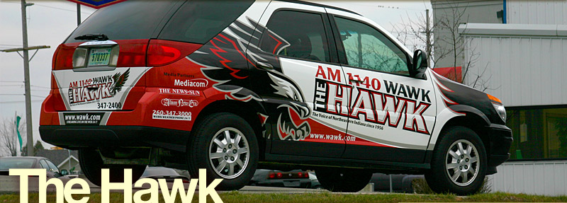
- VolcanoVistaHawks.com Black Hawk Artwork
- Community.mediacorp.com.sg Tickles the Evil Clown
- Flickr.com User White Tiger Art
- Flickr.com User Tribal Bat Tattoo
- Logotypes101.com Fire Giant Art
- ShutterStock.com User / Serbia Black Hawk Artwork
- Lacrosse.schigas.com Black Hawk Artwork
- Deviantart.com User Tribal Bat Tattoo
- IMVU.com User Tribal Bat Tattoo
- 895thehawk.com Black Hawk Artwork
- Dummidumbwit.wordpress.com Billy Mays Artwork
- Unconfirmedsources.com Billy Mays Artwork
- Emptees.com Tribal Bat Tattoo
- Mundozenn.com / Brazil Tribal Tattoo Face Art
- Deviantart.com User Tribal Bat Tattoo
- LAtimes.com Billy Mays Artwork
- SeemyButton.com Billy Mays Artwork
- Consumerist.com Billy Mays Artwork
- Brownsville Early College HS Scorpion Mascot Artwork
- EveryTattoo.com Tribal Tattoo Face Art
- Tao-Of-Tattoos.com Tribal Bat Tattoo
- Twitter.com User Self Portrait Illustration
- Discrim Athletic Tees Black Hawk Artwork
- Zazzle.com User Billy Mays Artwork
- Vyzion360.com Tribal Tattoo Lion
- Flickr.com User Tribal Tattoo Face Art
- Junklist.eu Two Headed Eagle Art
- JohnHaller.com Billy Mays Artwork
- Deviantart.com User Tribal Bat Tattoo
- Flickr.com User Tribal Bat Tattoo
- Picsquare.com Tiger Art
- Deviantart.com User Alien Skull Art
- Flickr.com User Tribal Bat Tattoo
- Skreened.com Billy Mays Artwork
- Gun Shop, Tacoma Espy Graphic Bird
- Photobucket.com User Black Hawk Artwork
- KosherHam.com Billy Mays Artwork
- InkedMedia.com Tribal Tattoo Skull
- MindSpark.com Billy Mays Artwork
- VectorStock.com User Doodle Fish Artwork
- case-mate.com Tribal Tattoo Face Art
- designbyhumans.com Tribal Tattoo Face Art
- (US Army) wood.army.mil White Tiger Art
- Zazzle.com User Owl Artwork
- WAWK.com Black Hawk Artwork
- Classiccitysigns.com Black Hawk Artwork
- Embroiderydesigns.com Alien Skull Art
- Flickr.com User Tribal Tattoo Face Art
- Houseofgrafix.net Billy Mays Artwork
- Uthstuph.com Security Shield Logo


"Unique" and colorful tribal pattern.

I don't enjoy getting my work ripped off and it frankly pisses me off when I have to waste my time dealing with it when it happens. That said I still try not to be a jerk with the people I'm forced to confront. I tend to give them the benefit of the doubt and try to treat the situation in a reasonable manner. If the infringer responds reasonably and works with me to resolve the matter than I can avoid taking it to next level legally.

But that isn't the case with case-mate. (Pardon the pun) I gave them three months to respond to my reasonable request regarding their infringement and use of my tribal face tattoo art on one of their products to no avail.

So as this year ends a copyright infringement lawsuit begins.

Follow Up: I've settled with case-mate. It took four months of back and forth but I was able to protect my copyright.


Blend it!

Selasa, 03 Desember 2013

My Uncle Pat


My uncle Pat holding his dog drawing.

My uncle Pat is a gentle soul. He's always smiling and will laugh in a heart beat if you say something funny. I love him dearly.

Pat is the younger brother of my mom and he was born mentally handicapped. Pat is 58 years old now and even though his mental capacity is some where in the range of a 7-9 year old, he possesses more common sense than a lot of people I know.

So when I got to hang out with Pat this Thanks giving I handed him a sketch book and a pen and said "Pat, draw a dog." He smiled and started drawing.


Uncle Pats dog drawing.

I had no idea how this was going to turn out? As I watched him draw I found it curious that he seemed to be keeping the drawing symmetrical.

As he was drawing I heard him say softly "I'm not very good am I?" to which I responded "There is no wrong way to draw Pat. You're doing fine."

When he was done he handed the sketchbook back to me and I said "Is this a Martian dog Pat?" We all laughed. My wife said "It kind of looks like a cow." We all laughed again.


Separated at Birth: Ron Perlman and Uncle Pat

That same day I mentioned to Pat that he resembled the actor Ron Perlman. I googled a picture on my iPhone and showed him. I than asked him to pose the same way and told him I'd put it on my blog. He thought that was pretty cool and smiled.


The Cheshire Pat.

Pat's smile is infectious. And we always have fun joking around with him and laughing together. Pat also has a habit of saying "I'm Sorry." for absolutely no reason at all, which has also made us all laugh at times too as you'll see in the below video.

I'll be sharing this post with him at Christmas so take a few minutes and leave my uncle a comment, I know he'll get a kick when I share them with him. Thanks!

Meet Uncle Pat


Kamis, 14 November 2013

From Inspiration to Illustration


"TRI 3Y3 Guy" character illustration.

Like the wind, inspiration can hit you at any moment from any direction, so I like to pay attention to the prevailing creative winds letting my imagination set sail.

Such was the case when I recently watched the movie Fargo. I hadn't watched since it's premiere back in 1996. The moment of inspiration came from an unlikely source, the forehead of actor Steve Buscemi.


Details of illustration.

So as I watched the movie I started drawing, a head start on an illustration project if you will. (Pardon the pun) The below video will take your through the entire chain of creative events.


"TRI 3Y3 Guy" t-shirt design.

Looking for that perfect give for your beloved mother in law? Look no further, nothing says "I love you!" more than a t-shirt of the "TRI 3Y3 Guy."


"TRI 3Y3 Guy" art print.

"TRI 3Y3 Guy" is available in three formats:
- Download PDF Art Print
- Download Wallpaper Files
- View / Order T-shirt

From Inspiration to Illustration